Repository navigation
fix(ios): the strip reads at the largest text size - #142
Merged
Merged
Conversation


At the largest text size Now's strip and the plan's lanes overlapped
and cut text: the kicker ran under the price now, the scale's 200 and
100 sat on each other, and the pass's figures ended in an ellipsis.

- The header keeps the kicker beside the price where both fit, and
  puts the price on its own line where they do not. Its hidden room
  for the price now has the price's real width.
- The pass's three figures stand one under another where they do not
  fit side by side.
- A grid line keeps its figure only where it has room; the top's
  figure wins. The level row's 0 % keeps clear of the price's top
  figure at any size.

Co-Authored-By: Claude Opus 5.5 <noreply@anthropic.com>

Codex Review SummaryThis comment shows the latest Codex review activity on this pull request.
ℹ️ About Codex in GitHubYour team has set up Codex to review pull requests in this repo. Reviews are triggered when you
Codex reacts with 👀 while any review is running, comments if it has suggestions, and reacts with 👍 once all reviews finish with no findings. |


This file contains hidden or bidirectional Unicode text that may be interpreted or compiled differently than what appears below. To review, open the file in an editor that reveals hidden Unicode characters.
Learn more about bidirectional Unicode characters
Sign up for free
to join this conversation on GitHub.
Already have an account?
Sign in to comment

Add this suggestion to a batch that can be applied as a single commit.This suggestion is invalid because no changes were made to the code.Suggestions cannot be applied while the pull request is closed.Suggestions cannot be applied while viewing a subset of changes.Only one suggestion per line can be applied in a batch.Add this suggestion to a batch that can be applied as a single commit.Applying suggestions on deleted lines is not supported.You must change the existing code in this line in order to create a valid suggestion.Outdated suggestions cannot be applied.This suggestion has been applied or marked resolved.Suggestions cannot be applied from pending reviews.Suggestions cannot be applied on multi-line comments.Suggestions cannot be applied while the pull request is queued to merge.Suggestion cannot be applied right now. Please check back later.
Problem
Before a new beta, main was checked in the simulator at the largest text size (Accessibility XXXL). Now's strip and the plan's lanes, as merged in #138–#141, broke three ways:
NÄSTA 12 H · TOTALPRIS INKL. MOMSran under180 ÖRE NU. The header kept room for a one-digit price,0 ÖRE, not the real one.200and100sat on top of each other: the price row is short there at that size.→ 3…,180…,till 2….The project guide asks the largest text size to look as good as the default.
Change
ViewThatFits), and puts the price on its own line where they do not. Its hidden room for the price has the real width of the price now.PassFiguresstands the three figures one under another where they do not fit side by side.PlanStripDrawingdraws a grid line's figure only where it has room; the top's figure wins. The level row's0 %keeps clear of the price's top figure at any size.The default size does not change.
Evidence
xcodebuild buildfor the iOS Simulator (app, widgets, watch): passed.swift testinappleApp/FTWKit: 643 tests in 98 suites and 348 in 29, passed.The plan's lanes at the default size, after: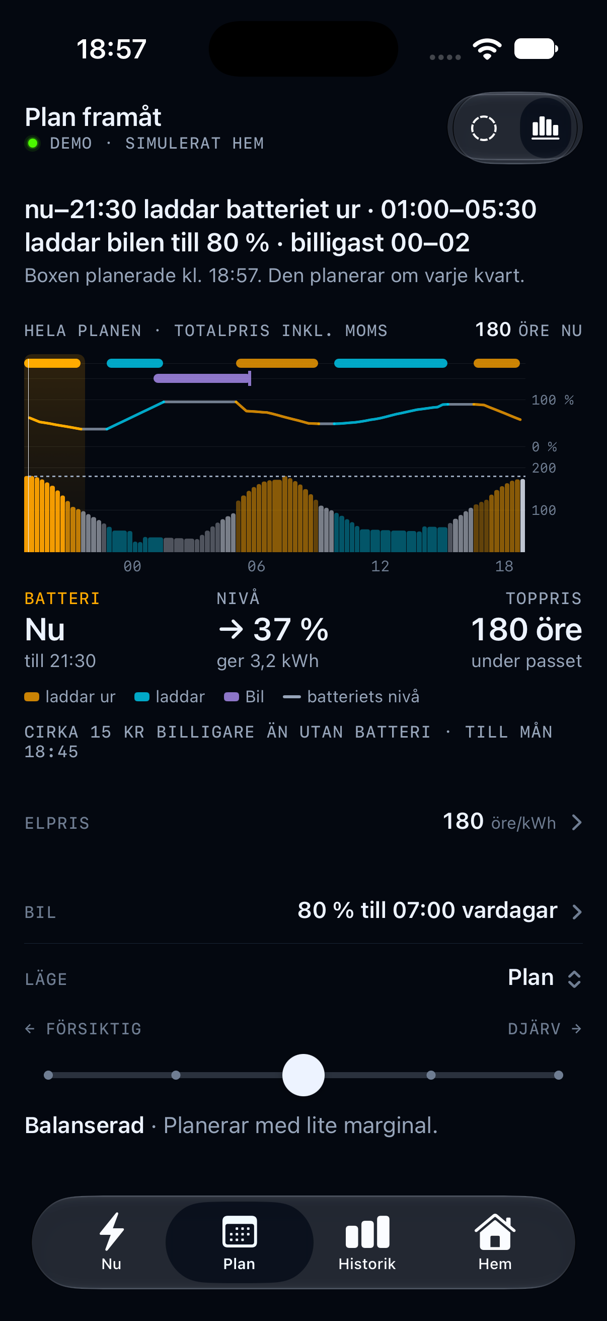
Main was also run on a paired watch simulator (watchOS 27): the plan page draws the 12-hour dial and the price page stands on zero.
Not checked: VoiceOver, a device, the plan-dial widget.
🤖 Generated with Claude Code